
The problem was easy to name and hard to fix. Planning Analytics Workspace screens built by different developers, for different clients, in different offices, did not look like they came from the same company. Some of them did not look professional at all. Every developer had good reasons for the choices they made, and no two developers made the same ones.
That is not a talent problem. Building a working model in IBM Planning Analytics is a different discipline from arranging information on a screen, and nobody should be surprised that people hired for the first are not automatically fluent in the second. What was missing was not effort. It was a shared reference.
So we wrote one.
The Cubewise Planning Analytics Workspace design standards began as a conversation, during TechXchange 2026 in Orlando between myself and António Conceição, that turned into an invitation to build a reusable dashboard template, and grew into the guidelines that sit underneath it.
The timing was not accidental. Our Director Ben Heinl named 2026 the Year of the End-User, and a standard for how end users actually experience our work is the most direct answer to that we could give.
What the standard replaces
The honest description of what changed is that we removed things.
Personal preference. Decoration. Layout drift between one developer and the next. In their place we brought in a deep understanding of visual design, drawn from academia, from research, and from practice that has held up over decades rather than seasons. The point was never to install one person's taste as house style. It was to reduce the number of decisions that get made from scratch on every project, so the decisions that remain are the ones that matter.
Good design is invisible. It supports the user's thinking without drawing attention to itself.
It is not minimalism. It is clarity.
Five pillars
The philosophy sits on five ideas, and everything practical below is downstream of them.
- User-centered logic. Dashboards exist to answer questions quickly. Design backward from the decision the user has to make, never forward from the data you happen to have.
- Intentional simplicity. Every layout, color, and component either carries meaning or adds noise. There is no third option.
- Consistency as strength. Repetition of patterns builds trust. When users know what to expect, their attention goes to the insight instead of the navigation.
- Brand through experience. Cubewise is expressed in how a dashboard feels — structured, considered, empowering — and not only in where the logo sits.
- Scalable without compromise. A design that works once is decoration. A design that works everywhere is a system.
Layout: think in grids, not in widgets
A dashboard is a layout system. Treat it as one.
Work on a 12-column grid, with margins of at least two grid units left and right and one unit top and bottom. Reuse a single spacing scale everywhere: 10 to 20 px from the border, 20 to 24 px between major sections, 8 to 12 px between a label and the view it describes.
Align edges without exception. Every chart, view, and selector in a row shares the same top and bottom line. Tiles align to each other as well as to the grid, so pixel drift never accumulates. Filters that govern a whole page live in one band, at the top or on the left, and never scattered across the screen.
Place objects in the order a user will naturally follow them: left to right, top to bottom, in an F or an E shape. Put KPIs at the top, trends in the middle, detail at the bottom. Notes, instructions, and supporting data belong at the foot of the screen, because that is what they are — support for the screen's purpose, not the purpose itself.
Avoid scrolling in both directions. Prefer vertical scrolling with a fixed top bar carrying the title and the global filters.
White space is structure
White space is not what is left over after the content is placed. It does three jobs at once.
It separates. People read groups by proximity, so the gaps between things are what tell a user which things belong together. It reduces load. When everything is packed at equal density the brain has to work out the structure before it can read anything. And it controls focus, because space is the quietest way a designer has of saying look here first.
Borders follow from the same logic. Prefer square corners. A 0 px radius reads as precision, seriousness, density — the visual language of enterprise software. A 4 to 8 px radius reads as friendly and soft, which is the right choice for a consumer product and the wrong one here.
Logos go top-right, and small. Top-left is the highest-attention zone on the screen, and a logo placed there competes with the title, the filters, and the first KPI a user needs. Top-right sits in a low-interference zone: visible, non-blocking, stable across screen sizes. A dashboard is a decision tool, not a marketing page. Brand belongs on it as a signature, not a headline.
Color: less equals more signal
Three roles, and no more. A neutral background so the data stands out. One primary brand color. One or two secondary or focus colors.
Semantic color is reserved for status and never used for decoration. Red means bad. Green means good. Amber means alert. If a color on your screen means nothing, take it out.
The reason for the ceiling is not taste. People distinguish three or four categories without effort, and every category past that costs the reader something. With more than three or four hues in play, the question stops being what does this color mean and becomes which of these colors matters.
The recommended palette:
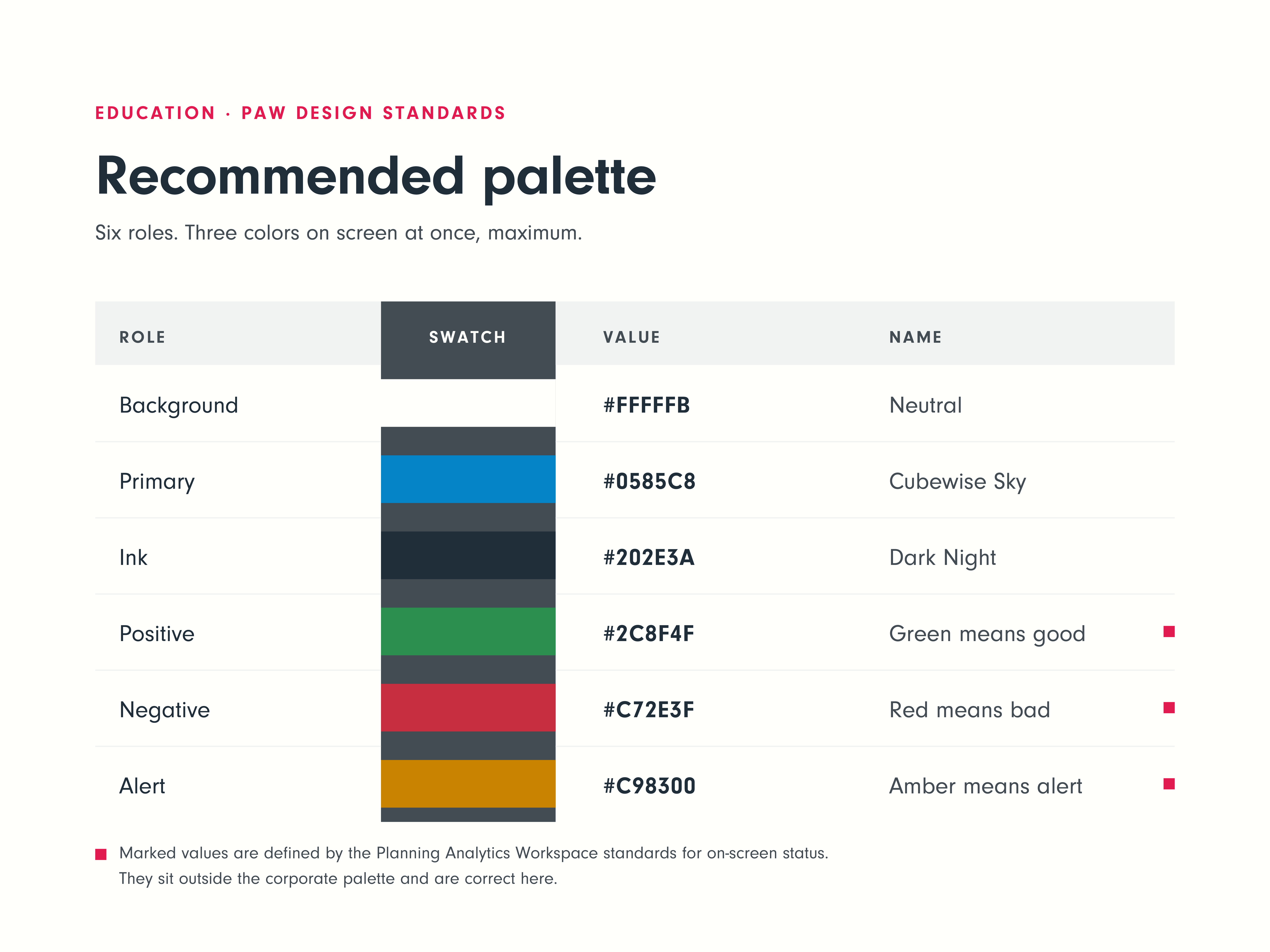
Keep contrast sufficient, and never let color be the only thing carrying a meaning. Back it with a label, a shape, or a position.
Typography: three levels, always
Twenty pixels, black weight, for the page title, the section opener, and the hero KPI number. Fourteen to sixteen pixels, medium, for panel titles, primary actions, and prominent labels. Eleven to twelve pixels, regular, for body copy, axis labels, table cells, and helper text.
Three levels are enough to build any hierarchy a dashboard needs. A fourth level does not add a rank; it blurs the three you already have.
Planning Analytics Workspace specifics
The general principles need a translation layer for the product itself.
- Dimension selectors show the hierarchy name, stand about 50 px high (6 percent), and are wide enough to display the longest element without truncation.
- Cube views use the cube view title. Do not add a separate text box above them — that duplicates the label and creates one more thing to keep aligned.
- Buttons stand about 50 px high, take whatever width the full title needs, and keep square corners with no shadow.
- Tabs, when they are on screen, are the title. Do not add a page title above them.
- The responsive grid setting is for specific situations, not for general use. Left on, it can shrink fonts, pad rows and columns unevenly, and shift the view at every selection, which is a confusing experience for someone who just wants the same screen twice.
- For interaction: keep global filters in one place, usually Year, Version, and Scenario. Make drill-down paths obvious. Give visible feedback on every action. Where a user can plan, highlight the editable fields and confirm the save. Nobody should ever have to wonder whether their number went in.
Six checks before you ship
Run these on every dashboard.
- Fonts — sizes consistent across objects and sections.
- Alignment — to the 12-column grid, and to each other.
- Order — placement follows the order of use: left to right, top to bottom, F or E shape.
- Sizing — object dimensions and borders uniform across the page.
- White space — consistent, and used to group and separate rather than to fill.
- Color — three maximum, with red, green, and amber reserved for status.
Six non-negotiables sit behind the checklist: everything aligns to the grid; a maximum of three colors; white space is structure; no horizontal scrolling where it can be avoided; three to seven visual elements per page; and white or gray backgrounds, which is a conversation worth having with a client rather than a constraint to concede on the first call.
What this is worth
There is a client-facing argument here that is worth making plainly.
A design system is brand value. When grids, spacing, typography, color, and interaction patterns are defined once and reused everywhere, our dashboards stop looking like the work of whoever was available that month and start looking like Cubewise dashboards. That recognition does real work. It shortens the time a user needs to learn a second screen after learning the first. It reduces the friction between a question and its answer. It gives a client a reason to trust the next deliverable before they have opened it.
Design is not an accessory to analytics. It multiplies what the analytics are worth, because a number nobody can find is worth nothing.
The standards are documented in the Cubewise Planning Analytics Workspace Dashboard Design Guidelines and condensed into the Everyday Standards Cheat Sheet for daily use. Start with the cheat sheet, keep it open while you build, and run the six checks before the screen goes to a client.